
Published Jun 25, 2020
Vannen Watches Reveals New Star Trek Line
Boldy go in style with these new watches.
StarTrek.com
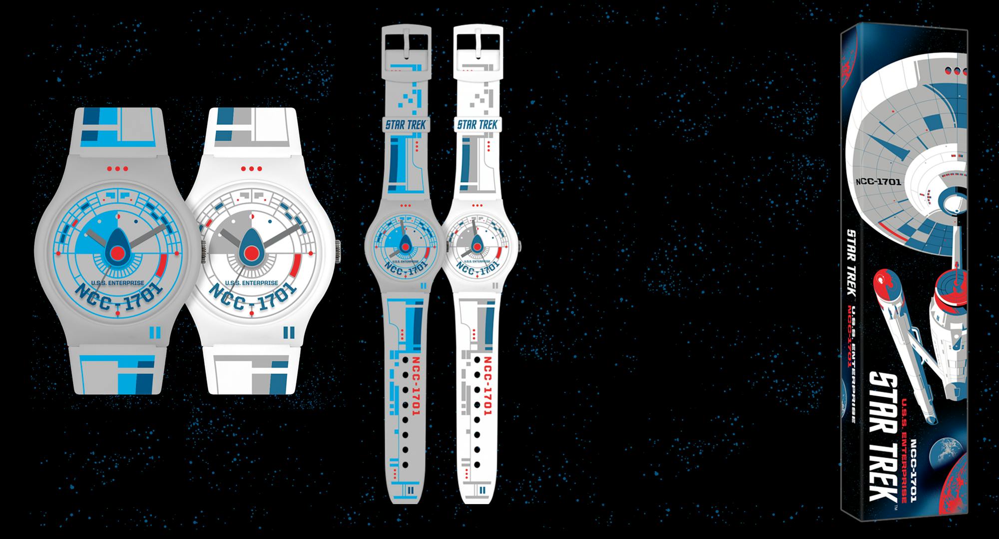
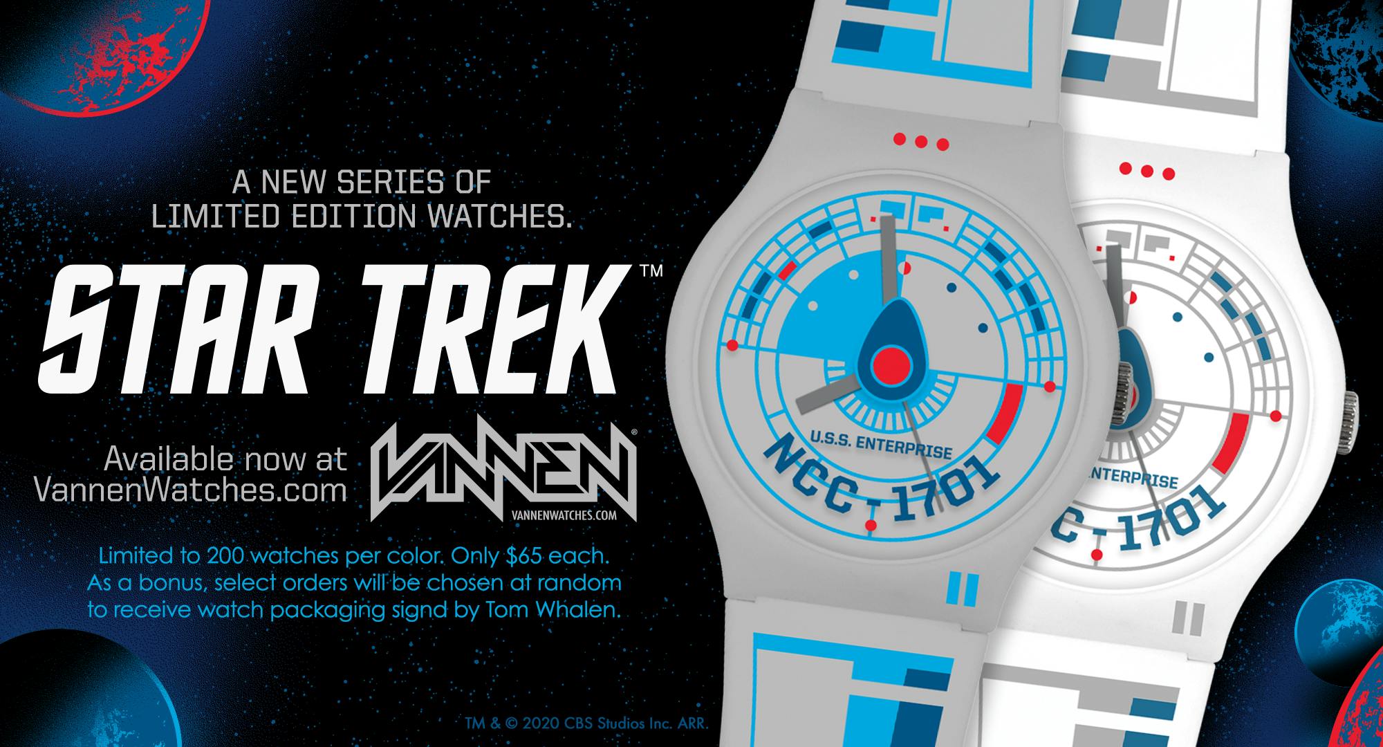
Star Trek is excited to announce a new series of limited edition watches created in collaboration with contemporary Watchmaker, Vannen.
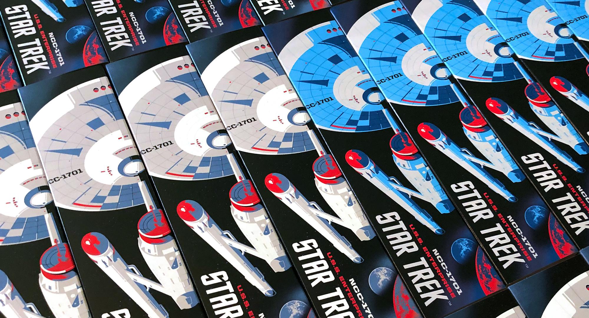
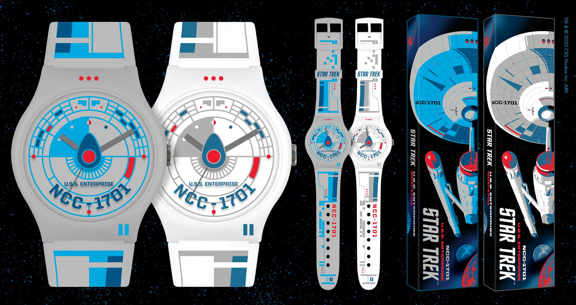
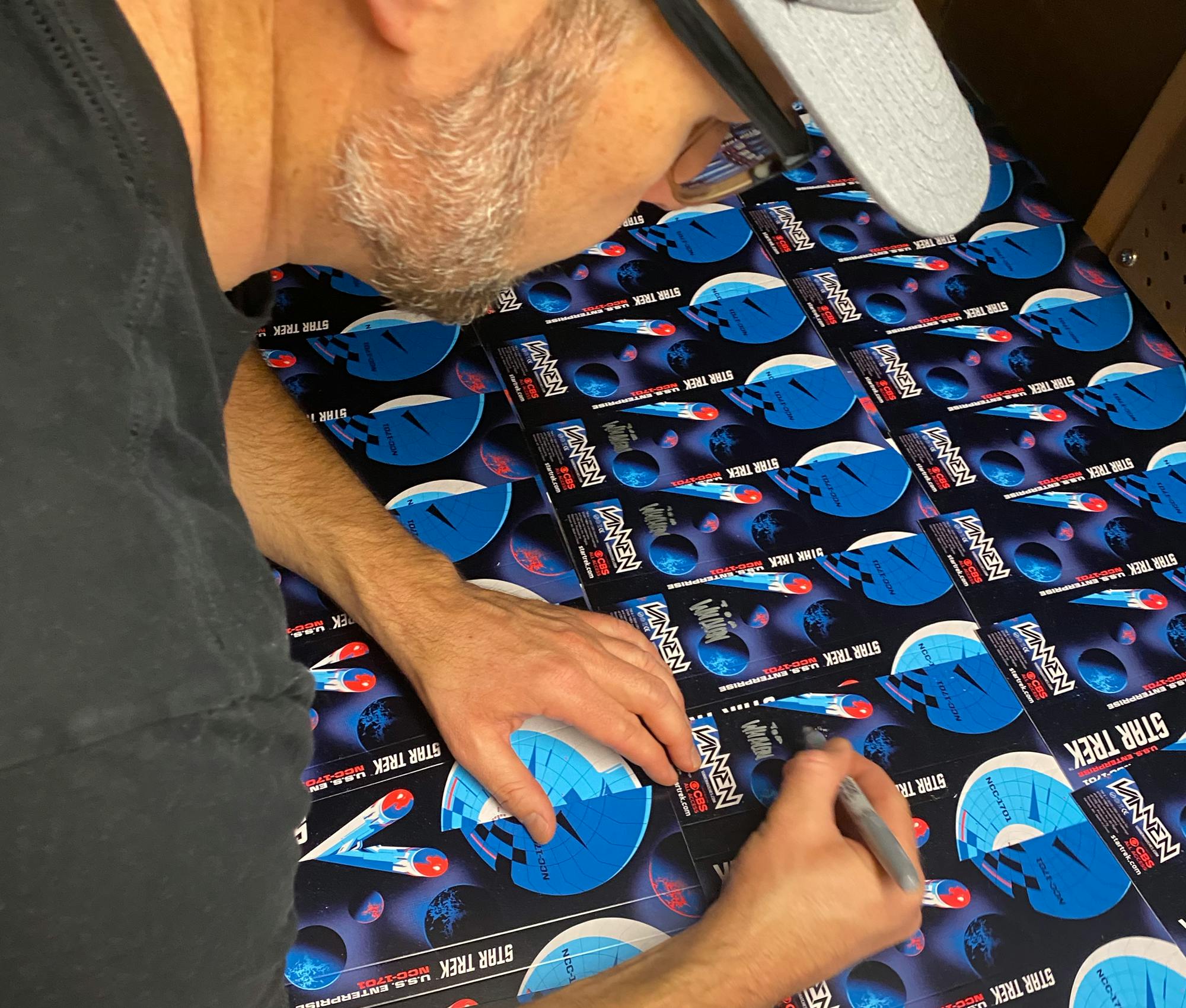
The first watch in the series was designed by Tom Whalen and will be available at VannenWatches.com starting on Thursday, June 25th at 9am Pacific Time. There will be two versions of the watch, White and Grey, limited to 200 pieces each for only $65. As a bonus, some lucky shoppers will find their Star Trek watch orders arriving in packaging autographed by Tom Whalen.
To celebrate the release of the new, limited edition Star Trek watches from Vannen, we asked David Stowe (Owner of Vannen, Inc.) and Tom Whalen (artist/designer of U.S.S. Enterprise watch) to share with us the process behind creating their new watch.
StarTrek.com
David Stowe: Hi, Tom. Thanks for taking the time to chat. For the people who aren't familiar with your work, please tell them a little bit about yourself.
Tom Whalen: My name is Tom Whalen. I’m a designer/illustrator, and I’m primarily known for my poster work, which has led to me getting involved most recently with toy packaging design. But what really got me into this groove was creating posters for Mondo, Bottleneck Gallery, and Gallery 1988, by taking existing movies and putting my spin on them.
DS: I remember reading that you grew up in your grandmother’s candy store. Do you think that being around the color palettes and designs associated with candy packaging had any influence on you?
TW: You know, I've never put that question to myself, but I think it did. I have such a love of typography, packaging, and product design that it must’ve had an influence. Like, as soon as you said that, my head went back to all those the candy boxes on her shelves and just bright colors. I'm sure it definitely has a foundation in my work.
StarTrek.com
DS: Your color palette is one of the things that drew me to your work. I don't remember the exact poster, but it was 12”x 36” and it had great color and perfect composition for such an unconventional canvas area. What made you start working in that size? Was it so you could stand out in the poster scene, or was it just a challenge that you fell into?
TW: Subject matter pushes me into that. I'll get an assignment for a poster, and I'm not sure which size or format will work. Sometimes it's automatic, and it's like, “Oh, that definitely needs to be a 12”x 36” or it needs to be an 18” by 24”. Regardless of the size, I love playing with the edges of a canvas area, and I love cropping in interesting ways. 12”x 36” lets me get some pretty interesting crops and bleeds.
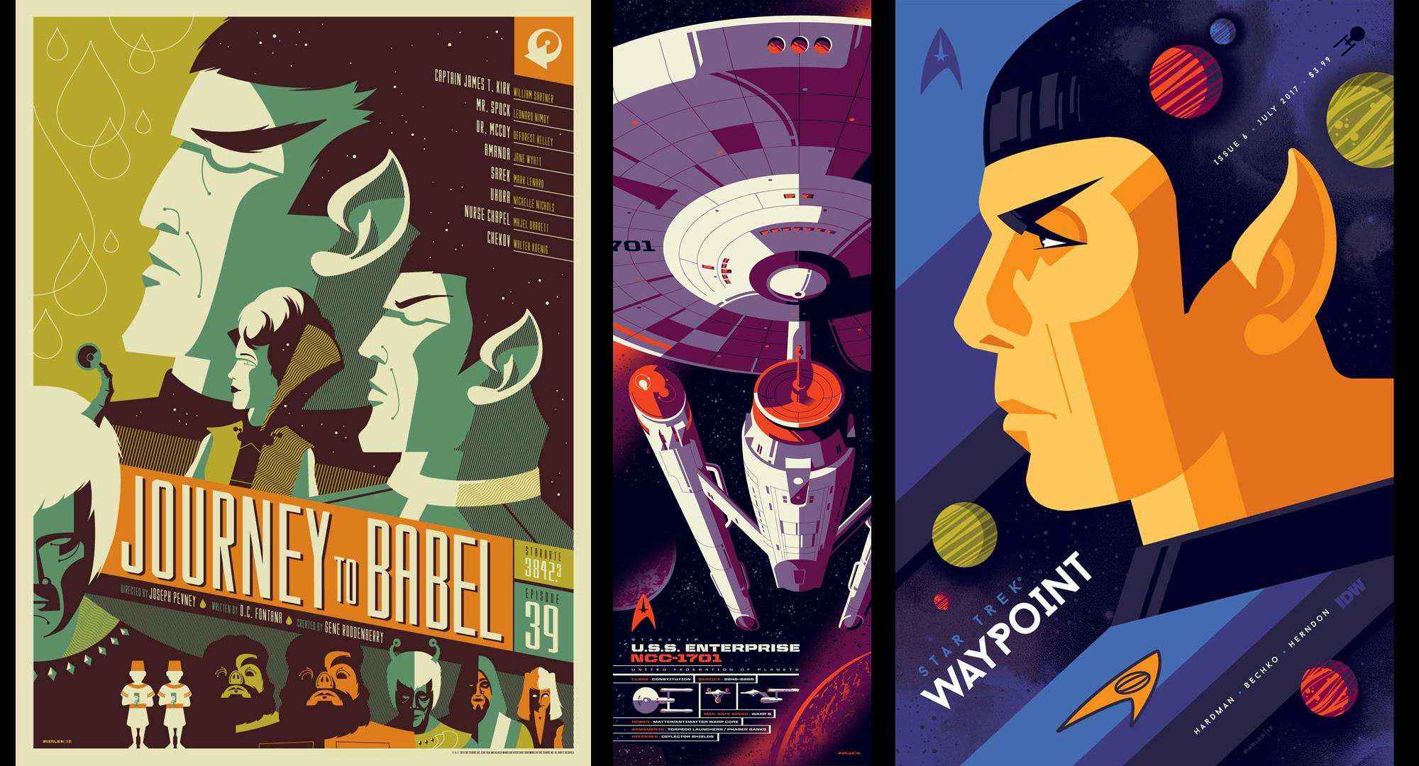
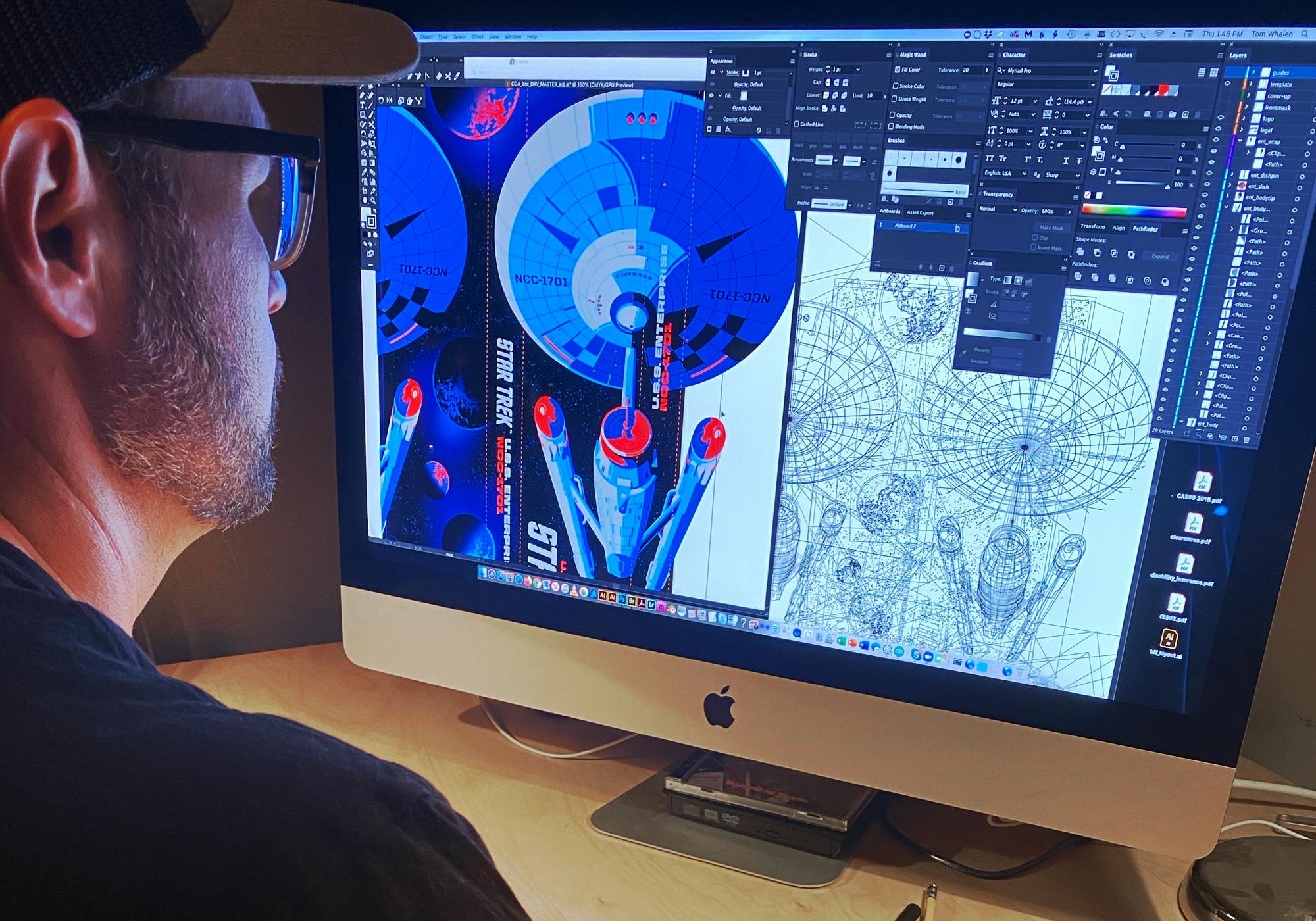
DS: Speaking of that poster size, when I first saw your ‘U.S.S. Enterprise’ print for Star Trek’s 50th Anniversary art show, I immediately thought to myself, “That is the perfect image for Watch packaging.” Since that print was proportionate in scale to the front panel of your Watch packaging, was it easy to rework that print for the box, or did you run into any challenges?
TW: No major challenges. I was excited to reinterpret the image for the packaging because it’s so close to the correct size. The only challenge was getting everything to fit and to balance all that art on a three-dimensional surface area and making it work seamlessly.
StarTrek.com
DS: The packaging is always the first obstacle. Now that you’ve finished the packaging, are you happy with how it turned out?
TW: I'm ecstatic. I love it. To be honest, I had the whole process wrong in my head before we started. I thought for sure that starting with the watch first would have been the way to go. But going in with you – and you having that experience of how to design a watch and packaging – I quickly realized the watch has to be an extension of the packaging and the overall experience. I'm very grateful for the way you guided me through the process.
DS: Glad to be of assistance. Once your packaging was finished, we talked about taking elements from the ship and putting those bits on the watch and creating new, unseen elements from the ship. Like creating your version of the hull/bridge and using that as the centerpiece of the Watch. With that said, what was the best part of working on the watch? Was it the journey through the process of seeing it come to life, or was it simply just reaching the finish line?
TW: What I really loved seeing were the variations and colorways next to each other, and seeing those come to life during the process. Usually, it’s about the end result, and that's where I normally get my satisfaction. But seeing the piece completed and knowing what the Watch took from the box art to become a Watch was something else. Having to add and subtract to then learn where art should be, or shouldn't be, and where imagery should land so that it all comes together to create a piece that looks really cool, was a process.
StarTrek.com
DS: Designing a good-looking watch isn’t easy, and you can testify to that. Like you said, placement, balance, composition are crucial, and graphically the watch has to be an extension or shared experience of the packaging. But again, when I saw your original Star Trek 50th Anniversary artwork, and all the other work you’d done in those 12” x 36” posters, I knew you could handle it… and you did.
TW: Those skills of mine were really put to the test, like making a design work in a very unconventional shape and then also realizing that it's not just a shape but it's also a functional shape that's going to wrap around a wrist.
DS: One of the things I try to help designers with when we start working together is to let them know they need to be thinking 20 steps ahead of their current concept to make sure their watch and box are cohesive. Most people focus on the center of the watch, and then the straps are an afterthought with zero consideration, and then the box also becomes an afterthought. But with your design, the centerpiece of the Watch is a great focal point, and then your strap artwork complements the dial and crystal really well. What are some of your favorite details on the watch?
TW: The dial and crystal artwork is pretty insane. The way that worked out with the added dimension and the functionally of traditional watch markings looks awesome.
DS: The dial design really is a fantastic combination of traditional Index Markings (hour, minute, second markings) and your interpretation of what the top half of hull/bridge looks like in your design style.
TW: That was another interesting challenge because the hull/bridge wasn't made to be the dial of a Watch. But I think it's close enough that it reads as both the ship and the dial.
DS: It does indeed. That's the beauty of the design. It’s a dial that people can read, and it has an extra dimension with the artwork printed on the crystal, which turned out really great.
StarTrek.com
TW: Thanks. It was a cool project to work on.
DS: I hear you didn’t get into Star Trek until later in life. Was there a particular episode in the Original Series that got to you, or was it a moment where the show just clicked?
TW: It was actually for an assignment for probably my second poster for Mondo. They hired me to do a poster inspired by the episode “Journey to Babel” from the original Star Trek series. I was familiar with a lot of the alien species in that episode, but that was probably the first episode where I properly paid attention. But from that point – from my assignment with Mondo – I've watched all The Original Series episodes, and I’ve genuinely enjoyed them.
DS: Do you have a favorite episode from The Original Series?
TW: “Let That Be Your Last Battlefield” is my favorite. The socio-political allegories in that episode are just great.
DS: Do you have a favorite character from the original series?
TW: Spock was always my favorite. I loved the way he always delivers the cold, hard facts. And then when he would break from Vulcan Spock – where you saw the human side of him – I thought those were great moments, too.
StarTrek.com
DS: With that said, is there a character from the original series that's most like Tom Whalen?
TW: Oh, wow! I might have to say Spock because I get down to business, and I don’t beat around the bush. That's maybe not the greatest character trait, but it’s the one that's closest to anybody on the show.
DS: I can see that. I'm more like Scotty: accommodating, resourceful, and I can fix stuff that’s been destroyed by alien saboteurs. Before we go, tell everybody where they can find, follow, and buy your stuff?
TW: My website is Strongstuff.net, and there's a link to my shop in there, which is Strongstuffshop.net. And on Twitter, I'm @Strongstufftom, and on Instagram, just @Strongstuff.
DS: Awesome. Thanks again.
TW: No problem. Thank you.