
Published Jul 22, 2013
Star Trek Artist Juan Ortiz Was EVERYWHERE at Comic-Con
Star Trek Artist Juan Ortiz Was EVERYWHERE at Comic-Con

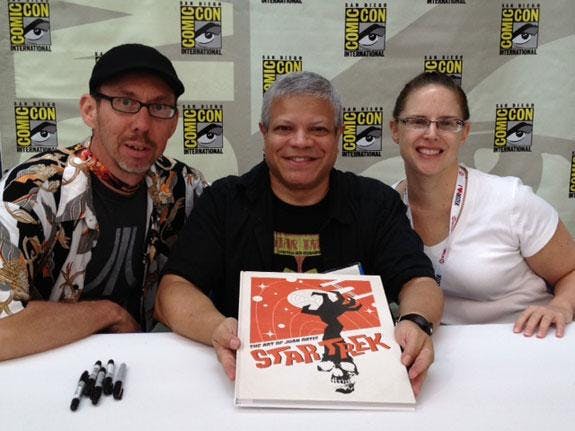
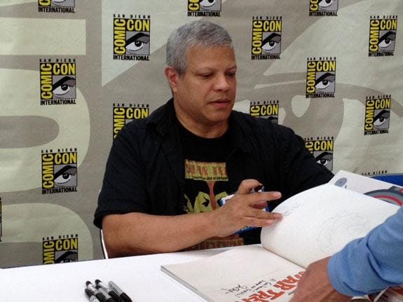
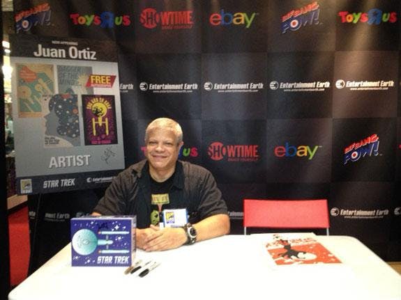
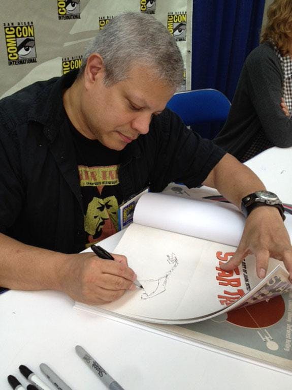
It’s only a slight exaggeration to say that this year’s Comic-Con should have been the Juan Ortiz 2013 World Tour. Ortiz is the artist behind the colorful and inventive Star Trek: The Original Series Art Prints, which have inspired posters, books, shot glasses, tee-shirts, coasters, wine bottle labels and more. For Comic-Con, he created the Klingon House postcards that StarTrek.com gave away to fans throughout weekend, and he beamed to San Diego for autograph signings on Sunday at the Titan (The Art of Juan Ortiz), Mighty Fine (posters) and Entertainment Earth/Bif Bang Pow! (coasters) booths. In fact, The Art of Juan Ortiz, which was available for purchase at Comic-Con, is a big hit, with its first printing already sold out.
“It was very exciting,” Ortiz told StarTrek.com of his time in San Diego. “Comic-Con has always been a fun event to go to. I always look forward to meeting fans of my work, talking about art, etc.”Ortiz then proceeded to talk about his latest pieces, the four Klingon postcards that he created as Comic-Con exclusives and which are now available as Klingon House Prints in the StarTrek.com Shop. The Klingon House Prints include Duras, Martok, Mogh and Kor.
“It was fun, but tough at first,” Ortiz recalls. “CBS wanted the house symbols on the posters, so I suggested a coat of arms type of design. It may have sounded like an easy idea at the time, but visually I found it difficult. Fortunately, with a bit of input from CBS and some cropping and tilting, the designs started to work for me. And I'm glad that CBS like them as well.”The trick for all of them, Ortiz thought, would be to combine Klingons with the usual banners and floral elements common to coats of arms, employing a “grunge look’ in order to tie the two styles together.” That still came across as too "soft" for Klingons. Then, CBS recommended skulls and a grittier look. “So I went to town,” Ortiz says. “I won’t mention what the Klingon lettering says because I only want the true Klingon fans to read them.”
Ortiz then breaks down each poster:“The MOGH design, after I cropped it, took on a Titanic movie poster look. The difference of course is that the shield is sailing on an ocean of Klingon skulls and the seagulls have been replaced with Klingon war-birds. I wish I could say it was intentional, but it just happened. I like when things just happen.” “The MARTOK design was supposed to have a targh head or skull upon the shield, but I was unable to acquire what one would look like. It was replaced with a Klingon skull, which then gave it a figurative look, with arms and legs. I added the circle or helmet around the skull to accentuate that look even further.”
“The KOR design was the most fun and the easiest to do. Rather than a usual shield, I used four Klingon bat'leth stacked upon each other to achieve the shield image. The Klingon skull and crossed knives, courtesy of CBS, really gives it a pirate’s look that I think all Klingons will appreciate.”“The DURAS design would not have been complete without the Duras sisters, Lursa and B'Etor. For this image I opted for a circular design. The daggers give it a ship's wheel look. I like to think that the two sisters are navigating their way through the Valley of Death.” Ortiz offers one final thought: “TbIjatlh 'e' yImev. yItlhutlh!”
Many of the products inspired by Ortiz’ art are available in the StarTrek.com Shop. Click HERE to visit.


