
Published Oct 27, 2011
Illustrator/Designer Rick Sternbach Recalls His Trek Days, Part 1
Illustrator/Designer Rick Sternbach Recalls His Trek Days, Part 1
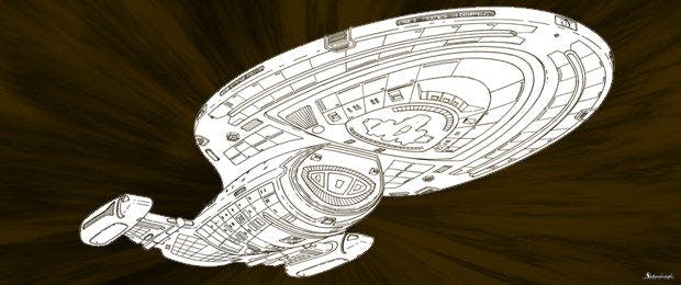
So much of Star Trek -- The Motion Picture, The Next Generation, Deep Space Nine, Voyager and Nemesis – simply would not have looked as it did were it not for the talents and imagination of Rick Sternbach. Over his many years with the franchise, Sternbach worked as a senior illustrator, designer, scenic artist, technical advisor and more. He helped create starships, weapons, props, etc. And, of course, he penned and/or illustrated several popular Star Trek manuals and blueprint books. StarTrek.com recently caught up with Sternbach for a detailed two-part interview in which he discussed his career, his years in the Trek universe, and what he’s doing today. Below is part one, and check back tomorrow for part two.How did you first hook up with Star Trek?Sternbach: Around 1974, three years after I left the University of Connecticut to pursue science fiction illustration work, I was fortunate enough to meet with Gene Roddenberry after a showing of “The Cage” at Yale University in New Haven. We spent a couple of hours talking about everything from Star Trek to the real space program to the future of humans in the galaxy. Remember, this was shortly after the last Apollo mission to the moon, Skylab was still up, and the Space Shuttle era was beginning, so it was a very heady time in terms of spaceflight activities. Gene was hoping that a Star Trek feature film was going to happen, though as we know it took another four years to get greenlighted. In 1977 I made the uncertain move to California to look for film and TV work, prompted in large part by seeing Ralph McQuarrie’s artwork for Star Wars a year earlier. A first meeting at Paramount with Joe Jennings, production designer on the Phase II Star Trek TV series, wasn’t particularly encouraging, but within five months the situation had changed. As we know, the series had morphed into Star Trek: The Motion Picture, and Joe asked me to come in.For those who are unfamiliar with what a senior illustrator/designer does, take us through your responsibilities over the years on Star Trek.Sternbach: Typically, I would read the script like everyone else, from the set designers and costumers to the carpenters and painters and visual effects folks, and make notes about hand props or ships or bits of high-tech set decoration that needed to be drawn up. Star Trek has always been a special case in terms of physical structures and equipment; you can’t go out and rent most of what we built. And we found ourselves needing to create and stick to a special set of design rules, both Starfleet and alien, that has kept us distinct from the majority of the “media SF” out there. I did pencil art, inked sketches, and color marker renderings for producer approval, and would interact with a lot of the other crafts on the lot who had a hand in making the designs on paper become real. A drawing for a big floor prop, say, an alien force field generator, would have annotations for practical lighting gear, paint specs, and suggested visual effects activity. Hand props were also done with those stylistic rules, and usually resulted in five or six versions for the producers to consider. I worked up starships and shuttles in blueprint form as well as sketches, primarily because I understood the hardware shapes and their functions, and the blueprints would make the jobs of the physical model makers and CGI experts a bit easier. I can thank my architect dad for teaching me the blueprint thing. You worked on everything from The Motion Picture through to Nemesis. What were some of the personal highlights for you, in terms of working experiences?Sternbach: With the design work, any major ship or prop has to be considered a highlight. That usually happened with something we knew would be highly visible, like a tricorder or phaser, or a ship like Voyager, or something in a script that just sounded so amazingly cool that it begged for a lot of sketch time. Seeing a completed model in the flesh was goose-bump time, even if I had seen intermediate stages of assembly. Standing inside a finished set with the lights on, with no stage walls visible, was always exciting. However, “exciting” can go in an unknown direction. One morning I got called down to the ST:TMP travel pod set by director Robert Wise, and I arrived a bit shaky, thinking I had screwed something up. In reality, he wanted me to explain to Jimmy Doohan what controls to activate to wake up the pod systems and make it go, since I had designed the graphics for it.There was a long, long time between The Motion Picture and Nemesis. In what ways did the passage of time, the evolution of technology and special effects, affect what you did and how you did it?Sternbach: There’s no doubt that the improvements made in desktop computers, and 2-D and 3-D graphics software, helped us do our art department jobs better and faster. On ST:TMP, most of the work I did involved India ink, rapidograph technical pens, and photocopy machines, as well as color markers and airbrush paintings. Computers were nowhere in sight, except at NASA’s Jet Propulsion Laboratory, who assisted us with some techy-looking animations. On ST:TNG, we started out almost the same way before we got our Apple Macintosh systems. By the time we got deep into Voyager, I was able to build rough 3-D models of ships and props and email the files out. I’d say that was progress, though I would also point out that my time was better spent nailing the design details in good old blue pencil and black felt pen, with a little marker color on top, plus the scaled blueprints. The modelers and CG wizards did their real magic from the drawings better than I could.What are some of your personal favorite designs?Sternbach: I used to try and pick a single favorite, but nowadays I’m content to simply list the U.S.S. Voyager, the U.S.S. Equinox and the Klingon Vor’cHa attack cruiser as my favorite designs, followed closely behind by Deep Space Nine, the Starfleet Runabout (done with Jim Martin’s design assist), the Delta Flyer, the TNG tricorder, and the TNG Type II hand phaser redesign for Season 3. Uh, and the U.S.S. Prometheus, and the Type IV compression phaser rifle, and Deep Space Nine, and the Cardassian disruptor. And the Romulan PADD. It’s so hard to choose.Let us ask you your memories of creating several specific vehicles and props: the Deep Space Nine space station, the U.S.S. Voyager, the PADD.Sternbach: Deep Space Nine went through a crazy few months of design work while the producers played with its origins, from an unknown ancient alien structure to the Cardassian station we know; scads of doodles and sketches and rough blueprints done to home in on something with which everyone would be happy. Exterior shapes had to match interior volumes and visible stuff like windows, but eventually it all solidified. And all the while, my inner design muse was speaking loudly to make sure it made some kind of engineering sense, even if it involved an alien way of thinking. That’s just how I operate. The central core, the habitat ring, and the docking pylons were worked out almost as if they were really going to be manufactured. Even if the audience didn’t know early on what a certain shape did, I knew, and depending on what the thing was, it could have been made important in a story later on. And it would have made sense.Voyager went through a similar process of large numbers of sketches and preliminary blueprints. Starfleet shapes and colors follow different design rules than Cardassian bits, but these are rules that have evolved since TOS, and I’ve always believed that our fans expect us to keep true to recognizable styles, within the context of each era. Sounds deep, doesn’t it? But it works. Voyager was described as a smaller ship than the Enterprise-D, with a smaller crew, and that drove the way it was designed. Windows would appear larger in proportion. Familiar pieces of equipment would be seen in more detail. A few rounds of blueprinting later, and it was ready for the model makers, with all the parts a good Starfleet ship should have.And the PADD, which has been back in the news…Sternbach: I can understand why there’s been some hoopla over the comparison to recent tablet computers, particularly the Apple iPad, but I really see the PADD as simply an outgrowth of science fiction data displays imagined for decades in literature and on screen. The PADD was initially scaled to be about the size of a paperback book, with a larger, more comfortable screen than the tricorder’s, and its internal isolinear circuitry was supposed to be many thousands of times more compact than in the clipboard Kirk was used to signing. I always assumed that the PADD would be a highly capable device, able to communicate with other tech devices. The fact that we have devices like it today doesn’t surprise me in the least. They’re all very, very cool, but I expected them to show up eventually. The only aspect about today’s gadgets that I don’t think I saw coming in 1987 was how multifunction they’ve become. I’m not sure if I designed the PADD and tricorder and other devices to be so limited in comparison or if they were just used on screen in limited ways. You don’t see people talking into a PADD or a tricorder, though there’s no good reason why they couldn’t have.
Check back tomorrow to read the second half of our interview with Rick Sternbach.


