Published Jan 7, 2013
January TOS Art Prints Available Now
January TOS Art Prints Available Now
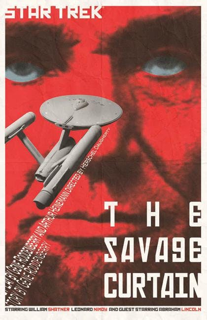
Juan Ortiz is back with the next quartet of TOS Art Prints, which are available right now. The four are “Mirror, Mirror,” “The Tholian Web,” “Miri” and “The Savage Curtain.” StarTrek.com caught up with Ortiz to chat about the reaction to his December renderings and to discuss his inspirations for the latest entries.
Let's start with a quick look back at December. What kind of responses did you get to the “Arena,” “The Naked Time,” “A Taste of Armageddon” and “Spectre of the Gun” prints? And which one did you get the sense was the most popular?Ortiz: There were a few complaints about three out of four having images of skulls in them. Other than that, the overall response seemed positive. One has to remember that they are not in chronological order, so the posters with skull images in them won't be overwhelming when all 80 posters are finally viewed. The one that received the most feedback was "Spectre of the Gun." It seems like the fans like the poster more than the episode itself. I'm a bit surprised. I've always felt that "Spectre of the Gun" is one of the better episodes.Something we've been wondering: before rendering the 80 TOS Art Prints, did you sit and watch all the episodes and then make notes, perhaps even draw quick sketches for each? What was the process?Ortiz: It was a combination of things. If I needed to, I would watch an episode again, but what was most helpful to me was researching the episodes online and getting more information as far as what the writers and producers were originally trying to achieve. Scripts go through several changes, so I find it more interesting trying to create an image based on what was written rather than the final result. Once I had an idea of what the image should be, I would then consider the style of the image. Any sketches that I may have done were very rough thumbnails, so that when I worked them up in illustrator the ideas would still be fresh and still in the process of being developed. I don't like working from a tight drawing, which oftentimes I would have to, if I were working from someone else's ideas. And just to keep me inspired, or awake, I would play the soundtrack from the first film or I would have the film playing in the background.
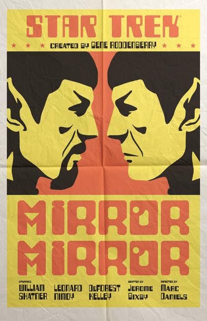
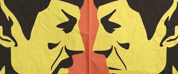
The first January print is “Mirror, Mirror.” We love how clean and simple it is, and the boxing match flyer style. Was there anything specific that inspired your choices on this one?Ortiz: It was the boxing match flyers that inspired me. I don't usually lean towards bold colors, but this time it works to reflect the excitement that a boxing match usually evokes. I chose the two Spocks because of the way “evil” Spock's iconic goatee strongly contradicts good/regular Spock.
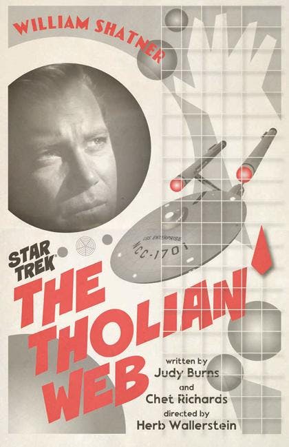
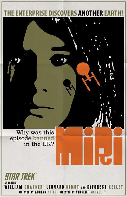
QMx will offer the four prints as a set of plated-printed lithographs on 100-pound, aqueous-coated, satin-finish paper. Each print measures 18x24 inches and the set of four is $34.95. US and Canada fans can purchase the sets at QMxOnline.com. See all of the sets currently available from QMxOnline.com HERE.
Pyramid will have the images available in the UK on Wood for £39.99 (43x59cm) and £49.99 (45x76cm), Canvas for £59.99 (60x80cm) and as Framed Art Prints at £49.99 (60x80cm). UK fans will be able to purchase the items at Amazon.co.uk, ForbiddenPlanet.co.uk and Oneposter.co.uk.
The next four images will be revealed in early February here on StarTrek.com.


