
Published Feb 4, 2013
Which February TOS Art Print Do YOU Like Best?
Which February TOS Art Print Do YOU Like Best?
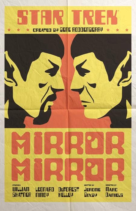
It’s time for our monthly chat with Juan Ortiz, the artist behind the popular line of Star Trek: The Original Series Art Prints. The prints for February are available now, and the episodes they depict are “Amok Time,” “Day of the Dove,” “Operation: Annihilate” and “Is There In Truth No Beauty?” Here’s what Ortiz had to say about his latest quartet. Go back to January's prints. Which one got the most reaction? And what was your sense of why it got that kind of reaction?Ortiz: I would say that it was "Mirror, Mirror." Fans love that episode and they love goatee Spock even more.
The art is also turning up on tee-shirts and shot glasses. What's it like for you to see how this whole thing has exploded?Ortiz: Having worked in the licensing business for a while, I'm not surprised by the use of the art. What is surprising is the speed of which things were getting done. I finished working on the posters in May of last year and the posters were out three months later. The first February print is "Amok Time." We love the weathered, dirty, damaged look it has. How did you settle on that?Ortiz: This was the first TOS poster that I worked on, so I really didn't know where I was going to go with them yet. In general, I like the distressed paper look, not because I wanted them to look old, but because it added another visual layer for me to play with.
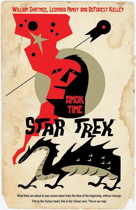
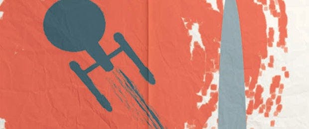
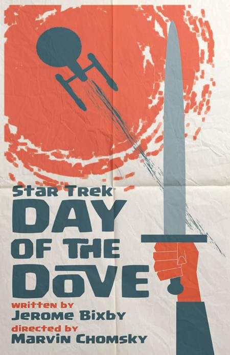
The dragon's fire certainly serves several functions. Did you plan that, or did you start with fire and expand it to the face and on upward?Ortiz: It was planned, but I didn't plan on how well it turned out. With the red coming out of the face, it looks as if he's contemplating his destiny in the stars. You also have an unusual amount of copy down below. What led to that choice?Ortiz: When I was done with the art, I felt the bottom of the page needed something to ground the dragon with. While I was designing the poster, I imagined it as an advertisement in the old TV Guide magazine. I was going to write down the time and channel info, but I went instead with something that T'Pau, the Vulcan elder, had said in the episode. "Day of the Dove" is next. What were your inspirations for that?Ortiz: This one was loosely inspired by Saul Bass' Spartacus (1960) movie poster. My original idea had the glowing red entity hovering above the Enterprise, but I felt that a Klingon element needed to be added.
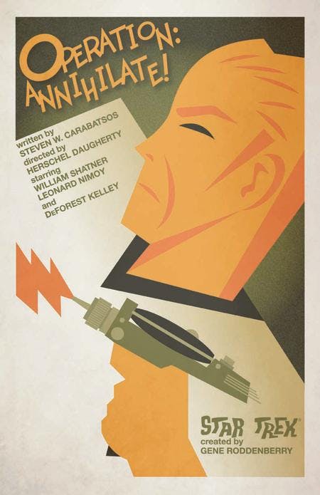
We love the colors and graphics you employed on "Operation: Annihilate." It's all very stylized, from the uniform to the phaser fire. Take us through your choices...Ortiz: I never know where the ideas are going to come from. This one was inspired by crate labels for oranges. A lot of the stylizing was done so that the phaser would be highlighted, almost framed within the illustration. Kirk's collar, the phaser fire and the hand all draw attention towards it.
"Is There in Truth No Beauty" is evocative and stark, and pretty much just black and white. What were you aiming for with this one?Ortiz: This one was inspired by Saul Bass' Birdman of Alcatraz movie poster. Originally, I was going to have the visor on Spock, but I felt that it was covering up too much of his face. I was hoping for a feeling of solitude. Spock always seemed like a lonely figure to me, always in thought.
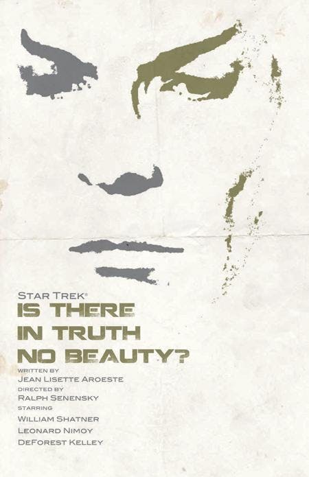
Is that image of Nimoy/Spock a photo, from footage or something you created? The angle of the eyes, the prominence of the eyebrows and the evenness of the lips speak volumes. Take us through your decisions...Ortiz: The image started out as a photo of Spock from an episode. I pumped up the contrast in photoshop to where it's mostly just shapes. Then I transferred the image to illustrator where I deleted parts of it and added texture and color. I knew the poster would work well from a distance, but the texture and color was done so that it would at least seem interesting up close.If you were going to hang one of these on your own wall, which one would it be and why?Ortiz: This is a tougher choice than last month, but I might have to go with "Amok Time." This one is a bit on the conceptual side, as you can probably tell by the image of the Enterprise. I think the added elements, like the dragon helps to expand upon the TOS universe, the way the Gold Key comics did. The dragon can also be viewed as a representation of Spock's "burning" need.
______________
The StarTrek.com Shop offers the four prints as a set of plated-printed lithographs on 100-pound, aqueous-coated, satin-finish paper. Each print measures 18x24 inches and the set of four is $34.95. US and Canada fans can purchase the sets HERE.
Pyramid will have the images available in the UK on Wood for £39.99 (43x59cm) and £49.99 (45x76cm), Canvas for £59.99 (60x80cm) and as Framed Art Prints at £49.99 (60x80cm). UK fans will be able to purchase the items at Amazon.co.uk, ForbiddenPlanet.co.uk and Oneposter.co.uk.
The next four images will be revealed in early March here on StarTrek.com.