

Part of the classless utopia hinted at in Star Trek is the sense that there's no longer a need to own things, man. With replicators available to all, conspicuous consumption seems a thing of the past. However, refinement and taste still abounds as does a celebration for the arts. Therefore we may conclude that there may still be a market for limited-edition licensed art prints in the 23rd and 24th centuries.It certainly exists now, as my ever-diminishing wall space can attest. The official Star Trek brand is currently licensed to two top-notch boutique art shingles, QMx and Mondo. Both regularly dazzle and delight fans. Indeed, the geniuses at QMx are still in the early stages of creating a separate print for each of the original TOS episodes (plus one for “The Cage!”)Before it gets too overwhelming, I thought now would be a good time to weigh in and choose my 10 favorite. (Maybe a year from now we can revisit this and see if the standings have changed.) Please note, this was among the most difficult “top tens” I've done in a while. I narrowed it down to 18, then 14, then 12. Removing those last two was heartache (especially since Seven of Nine was in one of 'em) but, hey, that's life. Some of these prints are more readily available than others. I'll include links where I can – for the others, take your chances on Ebay. Click the images below for those currently available.10 – The Menagerie
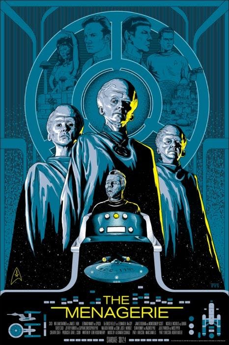
Artist Mike Saputo designed this for Mondo and it really nails the concept of turning a TOS episode into a movie poster. I love the use of the Gill Sans font (a sci-fi staple!) at the base, along with the cast and crew credits. The details in the halo are terrific, as is the color and shading around the Talosians. You've got old Pike in his chair below and the Enterprise under that, too. It's even got the Stardate down there.9 – Dagger of the Mind
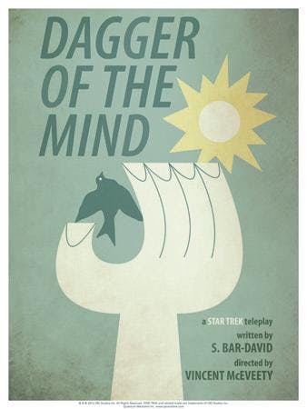
Designed by Juan Ortiz for QMx, this takes the very 1960s-looking bird, hand and sunburst worn by Dr. Tristan Adams of the Tantalus facility and gives it the iconic display it deserves. It's a combination of the colors and the lettering that makes this one remind me of the old El-Al Airline posters. Note that it isn't a white dove of peace, but a dark, perhaps ominous bird. Are treacherous things happening down on Tantalus?
8 – Wink of an Eye
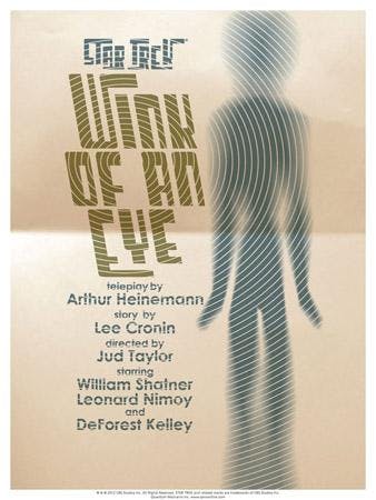
Another of Ortiz', this has a bit of an X-Files thing going on. The lettering is almost a bit retro for Star Trek, harkening somewhat to the 1950s. I like how the concentric circles and the change in focus almost tire your eyes – as if that's what it would be like to slip “out of time.” Follow the humanoid form from top to bottom and it fades from blur to sturdy and back again, like the buzzing Scalosians phasing in and out of our temporal perception. Groovy!7 – The Immunity Syndrome
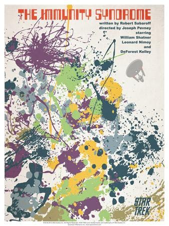
We're back to the 1960s again and you can almost hear the electronic synthesizer music when you look at Ortiz' title treatment. That's some hardcore early computer font, no? The imagery is an obvious reference to the abstract expressionist action painting of Jackson Pollock – a colorful choice for an episode about a “zone of darkness.” Only when you look at it for a moment do you see that, off to the side, a blotch of gray is actually the Enterprise.6 – The Trouble With Tribbles
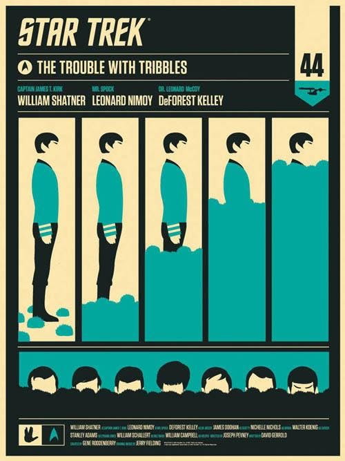
Olly Moss' design for Mondo is every bit as fun as the memorable episode it represents. Eggheads might call the main section “sequential art” as it shows Mr. Spock being overrun by Cyrano Jones' troublesome Tribbles. (We know, of course, that it was Kirk who was neck-deep in the furballs, but never mind.) Other highlights are the episode number (44) in the top right and the Vulcan salute down at the bottom left. As if Mondo's limited production orders weren't enough, they often produce smaller batched variants, too. For this one, Moss designed a mirror image of sorts - Uhura facing the opposite direction, undergoing the same Tribble-drowning, with red highlights instead of blue.5 – Catspaw
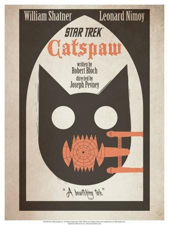
What? Can I put a poster up this high on the list for an episode that is, let's face it, a stinker? Yes, I absolutely can when it looks this cool. The title treatment has the Gothic flourishes of a Mario Bava horror film and the idea of a spooky feline skull chomping on the Enterprise is just too much fun to ignore. The added catchphrase (“A bewitching tale!”) is the perfect capper. This and the next two on the list are all Ortiz designs for QMx.4 – The Alternative Factor
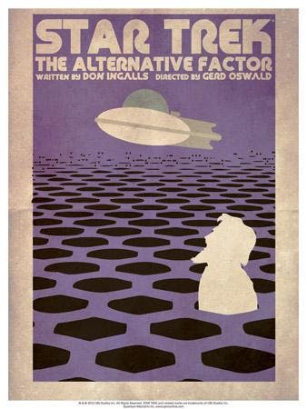
I love this one because it looks like it was designed a solid five years after Star Trek was cancelled. The lettering is so chewy and tube-like! Evoking the art of Rene Laloux's (of The Savage Planet) or perhaps any number of forgotten 1970s paperbacks, it's only after you stare at it for a while can you make out that that's Lazarus and his ship. (It kinda looks like Abe Lincoln a bit, but that's “The Savage Curtain.”)3 – The Ultimate Computer
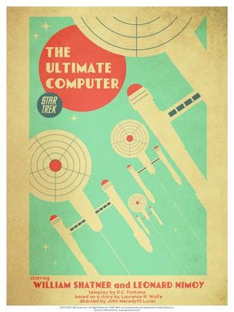
If Fred Astaire and Ginger Rogers were to ever exist in a Star Trek poster, this would be it. Evoking 1930s Art Deco (actually, with the curved saucer of the Enterprise, it is a tad “Streamline Moderne,” but let's not get crazy) this is one classy image of the great Constitution class ships. The lettering of Shatner and Nimoy's names just seals the deal. Even with the fact that this doesn't really represent the episode in a concrete way, this is one of the best of the posters made so far. I am proud to say that this is currently in a frame in the Jordan Hoffman Collection.2 – Journey To Babel
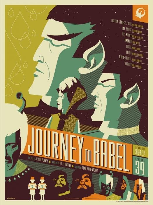
This wins the award for best fan service. You can stare Tom Whalen's design for Mondo for long stretches and still notice things. First, it's aping the style of Soviet era film posters. Note that the top right replaces the hammer and sickle with a Vulcan IDIC emblem. At the bottom are all the assembled diplomats from the mess hall sequences in the episode. Even those two little dudes with the fez-like hats. You've got Sarek, Amanda and Spock looking boldly off into the future, and below them, looking dour, is Thelev the Orion masquerading as an Andorian. I also love the credits listing toward the top right, going all the way to Nurse Chapel and Chekov. This one also hangs proudly in the Jordan Hoffman Collection.1 – The Corbomite Maneuver
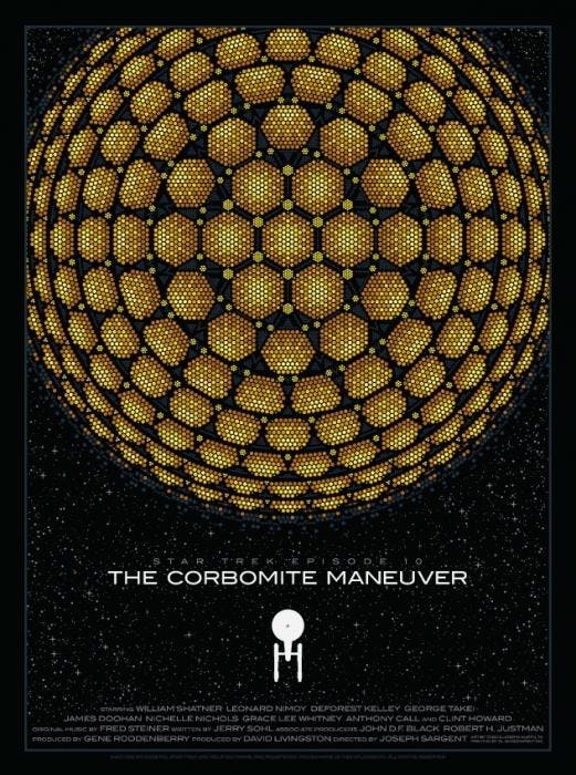
Perfection. Todd Slater's masterpiece of simplicity for Mondo is unlikely to ever be topped. Balok's massive and unknowable ship is scaled against the Enterprise, poised like an 8-bit video game on the final board. The lettering is once again a Gill Sans font – similar to the one used in 2001: A Space Odyssey. Other than the classic movie poster credits bar and the episode number above the title, the bold nature of the image is given room among the stars to speak for itself. And, yes, you can rest assured this one has some very prominent placement in the Jordan Hoffman Collection.Like I said up top, it killed me that there were some of the Mondo and QMx prints I couldn't include. Take a peek at their galleries and let me know what an idiot I am for leaving one off the list. (What's a wall without Seven of Nine?!!) Also lemme know if you own any of these and if you have found time to frame them!
_______________________________
Jordan Hoffman is a writer, critic and lapsed filmmaker living in New York City. His work can also be seen on Film.com, ScreenCrush and Badass Digest. On his BLOG, Jordan has reviewed all 727 Trek episodes and films, most of the comics and some of the novels.